
The whole idea of this album cover is to have a girls face with powder paint all over her on the front cover, filling up the whole page with bold and sharp text saying the name of the album (Love Me Again).
Iconography linked to sound...
- The powder paint shows the modern and young stance to the album. Because the powder paint is bright and colourful, it shows that the sound is going to be loud and upbeat.
Typography linked to sound...
- The typography that says 'Love Me Again' is in a very bold block type which shows that the song stands out and is very out there and is up beat. The fact that it is very sharp and angular shows that there is no flow to the song but that it is very to the point and up beat.
Conventions...
- The song that we have picked is a dance/pop song. The conventions of this genre of song is loud, bold, colourful, up beat and powerful. We have showed this in our album cover idea through the typography and the iconography with the bold and colourful text and picture.
Meta-narrative
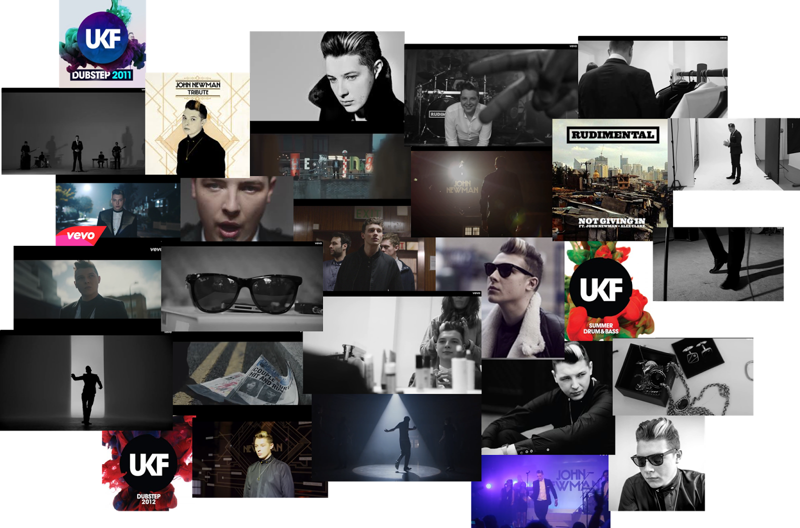
- John Newman has a traditional look to himself. He is very old school and retro. On his album covers you see dull colours and the main focus is him on the front. We have added the UKF (who remixed the song) look to our album cover and made it very colourful and bold to make it stand out as a dance/pop album.


