Tuesday, 6 May 2014
Friday, 2 May 2014
Evaluation Q1: In what ways does your media product use, develop or challenge forms and conventions of real media products?
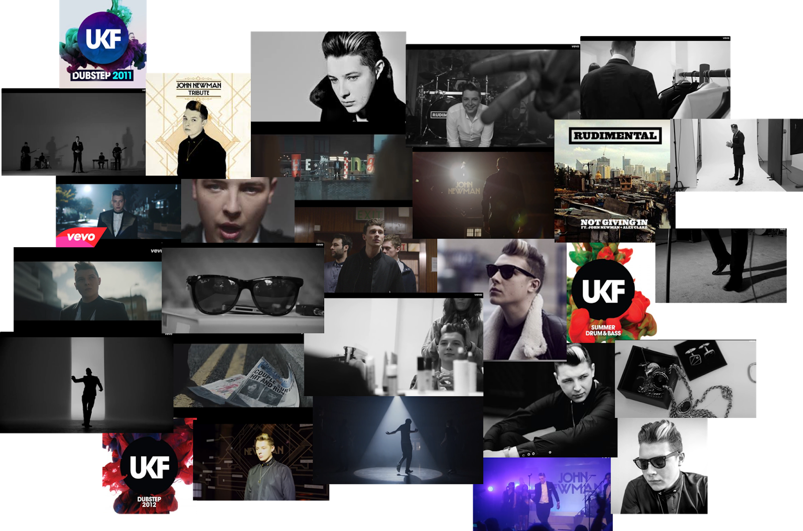
For our music video we produced an up beat energetic and lively video to go with our selection of music which was 'Love Me Again' by John Newman. We had to apply existing conventions of the dance/pop genre for it to look like a convincing and high quality music video.
After we had researched a number of different music videos within our genre of dance/pop, we found that there were many features and conventions which were all common throughout the music videos we analysed. For example, the use of bright colours and movement. We certainly incorporated this into our video right from the beginning to the end. Our main motif was the use of bright powder paint which we used to create a dramatic powder paint fight which combined with the movement of the people and the powder paint which created that dance/pop genre effect.
Another convention and feature that we saw in most of the dance genre of music videos was that there were relationships involved within the visuals. When we researched the videos we found that the relationships where more meeting in a club and having the night together and being presented in a more reckless way. We wanted to create our twist on this so we did not want to show this reckless behavior within relationships but instead we wanted to show true love and we showed this with a young couple who were arguing over something real in their relationship.
Finally, we wanted to create a twist on another feature usually found in dance/pop videos, We found that usually the teenagers would be associated to alcohol, drugs and partying and weren't grown up yet. We changed this and created a more light hearted representation of teenage life by using the powder paint to represent all of the alcohol, partying and drugs.
Thursday, 13 February 2014
Our posters
First poster

Second poster

Our posters took quite a lot of playing around with the layout and we took our inspiration from different posters within magazines. We added on the tour dates and then put in the conventions of a usual poster. We added in John Newman's web address and his social networking sites and we also added in a promotion for the album. At the bottom we put the ticket offices websites and telephone numbers in small print.
We ended up doing 2 different posters to show that you don't always have to use the same photo from the album cover but you can use different photos. With the eye you can still see that it is for this dance genre because it is loud and colourful showing the dance aspect. The poster with the face on it however, I think is the better one as I like the way it blends in with the black at the bottom and I think that the image is stronger and looks better with the style of poster.
Poster research
Biffy Clyros poster

Biffy Clyros album

From looking at Biffy Clyros album and poster we can see that he has used the exact same image from the album but just extended it and added tour dates and a few other conventions a poster. He has just taken the iconography from his album artwork and placed it on a separate page. He has then added the title and his name in the same typography but in a different size font than the album to make it stand out more. He has decided to extend it to a landscape photo and added the tour dates and the information about his album etc on the right hand side still in the same font so that it fits the conventions of a poster.
You can see in many other artists album and poster artwork, that they have literally just taken the same photo from their album and used as the main photo for their poster as well. For example, Everything Everything and their album 'Arc'. They used the same photo and just extended their poster to a portrait photo and added the tour dates etc at the bottom.
Everything Everything's poster

Everything Everything's album

Our Digi-pack
Front - This is the front of our album... We thought about which picture we could use and we decided on this one as we thought it was a strong photo. It represents the dance aspect of the album and it relates to the music video for the song 'Love Me Again' on the album with the link to the powder paint. We used this specific typography to also represent the dance aspect. The letters are block capital and are sharp and bold just the the dance genre.
Inside left - This is the inside right of our album... We all felt that this photo was a very strong photo with the quality at a high standard. We liked the way there are parts of the photo that are in focus and parts that are out of focus. This also shows the busyness of the album and the fact that it is upbeat with the use of colours and bright exposure. We wrote a little bit of small print at the bottom to fit the conventions of the inside cover of an album.

Inside right - This is the inside right of the album... We decided to keep this side plain black as we wanted it to contrast with the font cover and the inside left cover. This side has the CD on it and we wanted that to be plain black with 'John Newman' written in small print around the inside ring of the CD. We thought this would bring power but also calm down the busyness of the album itself.

Back - This is the back of our album... We decided to use the back of her head as the back of the album as this fits the conventions our genre. This was the most difficult part of the album as we weren't quite sure what font to use for the song names. However, in the end we used the same font as on the front but just made it smaller. We used a bar code at the bottom and put in the conventional things such as the record labels logo and John Newmans' website information as well as the productions companies information (SANE Productions, which is us by the way!)

Sunday, 9 February 2014
Our inspiration
We took our inspiration for our album cover and poster from Young Kato's album 'Drink, Dance, Play'. They used bright colours and made the whole cover look bold and bright. They also used a completely different person who isn't in the band, to be on the front cover. This is the same as what we have done. The bright colours that they have used, show the up beat and loudness of the album. This is what we have tried to get across too.

Friday, 7 February 2014
Research
We have done a lot of research into the digi pack by looking at lots of different album covers and seeing exactly what they have on the front the back and the two inside covers. We can then use these to organise the writing etc that we need on each side. For example, on the back of the album we will need a barcode and some small print at the bottom. This is one of the conventions of a hard copy of an album. Once this is all done, it will have the main conventions for it to look like a proper album.
Typography for our digi pack
We had to find the right typography for our digi pack and we found the correct one online. It is sharp, angular and bold to represent the sound of the album and the fact that it is up beat and dancy. We managed to lay out the name of the album and the name of the artist on the front of the album after lots of moving it abaout and changing the size of the font. We are now trying to sort out the back of the album as this is a little bit harder and we are not sure what font to use. It is hard to make the back of the album actually look like a proper album cover. This is the main problem we are having at the moment.
Photo shoot for ancillary task
Today we went out and shot our 4 covers for our digi pack. We went into a dark room that had black walls and turned off all the lights. We used a spotlight to just light up the face and not the background so that the background was black. We decided to have the front cover as the main girl in the video with powder paint over her face. This would link well to the video where they are chucking powder paint. For the back we have decided to use a shot of the back of her head which doesn't have powder paint on it. This links well with the studio shots that we took in the video. On the inside covers we have decided to use a close up her of her eye covered in powder paint and also a close up of her lips on the other side.
The photo shoot went very well and we got more photos than we needed just incase so that we had enough. The close ups of the eye were the shots that were the most successful within the shoot. However I think the front picture is very strong and is a good iconography for our music video.
Thursday, 23 January 2014
Third album cover idea

The whole idea of this album cover is to have a girls face with powder paint all over her on the front cover, filling up the whole page with bold and sharp text saying the name of the album (Love Me Again).
Iconography linked to sound...
- The powder paint shows the modern and young stance to the album. Because the powder paint is bright and colourful, it shows that the sound is going to be loud and upbeat.
Typography linked to sound...
- The typography that says 'Love Me Again' is in a very bold block type which shows that the song stands out and is very out there and is up beat. The fact that it is very sharp and angular shows that there is no flow to the song but that it is very to the point and up beat.
Conventions...
- The song that we have picked is a dance/pop song. The conventions of this genre of song is loud, bold, colourful, up beat and powerful. We have showed this in our album cover idea through the typography and the iconography with the bold and colourful text and picture.
Meta-narrative
- John Newman has a traditional look to himself. He is very old school and retro. On his album covers you see dull colours and the main focus is him on the front. We have added the UKF (who remixed the song) look to our album cover and made it very colourful and bold to make it stand out as a dance/pop album.
Second album cover idea

For this album cover idea we came up with a symbol for the song. We picked a heart for the 'Love' part of the song and we put an arrow on the end of the heart to show the 'Again' part of the song. Together, this symbol spells out 'love Me Again'.
Iconography linked to sound...
- We decided that the Outside of the heart would have splattered powder paint on a black background with the heart filled in black. With the bright colours of the powder paint and the boldness of the black heart, this shows that the sounds are going to be loud and very sharp and to the point. It shows the dance/pop genre within the album cover.
Typography linked to sound...
- The typography that says 'Love Me Again' is in a very bold block type which shows that the song stands out and is very out there and is up beat. The fact that it is very sharp and angular shows that there is no flow to the song but that it is very to the point and up beat.
Conventions...
- The song that we have picked is a dance/pop song. The conventions of this genre of song is loud, bold, colourful, up beat and powerful. We have showed this in our album cover idea through the typography and the iconography with the bold and colourful text and picture.
Meta-narrative
- John Newman has a traditional look to himself. He is very old school and retro. On his album covers you see dull colours and the main focus is him on the front. We have added the UKF (who remixed the song) look to our album cover and made it very colourful and bold to make it stand out as a dance/pop album.
First album cover idea

For this album cover we decided to have a totally black background with just one hand print that had been covered in bright, colourful powder paint, in the middle of the cover.
Iconography linked to sound...
- The bold and colourful hand against a very black background shows that the sound stands out and just like the hand does. We decided to do a hand print because it links to throwing powder paint which is in our music video. I think the fact that there is just one hand print on a black background shows the power of the song.
Typography linked to sound...
- The typography that says 'Love Me Again' is in a very bold block type which shows that the song stands out and is very out there and is up beat. The fact that it is very sharp and angular shows that there is no flow to the song but that it is very to the point and up beat.
Conventions...
- The song that we have picked is a dance/pop song. The conventions of this genre of song is loud, bold, colourful, up beat and powerful. We have showed this in our album cover idea through the typography and the iconography with the bold and colourful text and picture.
Meta-narrative
- John Newman has a traditional look to himself. He is very old school and retro. On his album covers you see dull colours and the main focus is him on the front. We have added the UKF (who remixed the song) look to our album cover and made it very colourful and bold to make it stand out as a dance/pop album.
Lupe Fiasco - iconography
Iconography...
Iconography is the symbolic representation, especially the conventional meanings attached to an image or images.

Lupe Fiasco...
Lyrics Vs visuals - The lyrics of the song 'Superstar' match the iconography of the album cover because it is almost like he is out of this world and in outer space. Superstar is quite a Si-fi word and fits with the look of the cover, with the bright lights and the fact that he is floating.
Sound Vs visuals - The sound of the music fits with the look of the album cover because although this music is slightly mellow it shows that he is up and coming and it shows a slight modern tinge to it. The fact that he doesn't fill up the whole cover may show that he is not the only person on this track and that he does collaborations with other people.
Typography - I didn't think that the typography went well with the sound of his music however I do think it fits with the album cover because it look like it's from out of space just like the picture.
This whole research of other peoples album covers will help us with our ancillary task by helping us find the right iconography to use and the right typography to use. We can see that the iconography, typography, sound and visuals all fit together nicely and this is what we need to achieve within our ancillary task.
Sunday, 5 January 2014
MTV Dance logo and final music video
We were almost at the end of the editing process and there was just one last thing to do to make it look complete. To make it look like a real, professional music video, we decided to put the MTV Dance logo in the top left hand corner. This would make it look more believable as a real music video that is being played on a music TV channel. It definitely gives our music video the final touch and makes it look complete and finished. Once we had done this, we watched the whole music video back from start to finish and we decided that it was complete.
Our final music video...
Letter boxing
Now that our sequence was completely finished and edited with the colour grading all done, we could letter box it all, which means to have two black strips, one at the top and one at the bottom of the screen, which makes the whole thing look more professional. This took up a lot of time too as we had to do it clip by clip again. We then had to change the aspect ratio of some clips as the blacks strips had cut out peoples faces etc so we had to just move the clip up or down so that the whole image fitted into the screen. Another reason why we chose to letter box it is that a lot of other dance music videos have done it so it seems to be a convention of dance music videos. Once we had finished letter boxing the footage it almost looked complete.


Editing
We had a bit of a problem when sending the file back to Final Cut Pro from Color. When the footage got back to Final Cut Pro, There were a few clips that went missing and hadn't been colour graded. We then had to find the right clips and put them back into their places by looking at the original sequence and finding the correct clips. After we had sorted this out and all the sequence was back together, we had to colour grade those clips in Final Cut Pro which meant doing them separately. There were quite a few clips to do so this took up a bit of time. However we did get it done and the sequence was now all back together and colour graded making it look like a music video.
Colour grading
We new that our music video didn't quite look right for some reason and we decided it was because the colouring wasn't right and the scenes then seemed not to fit together as one music video. The powder paint fight was too grainy and didn't have enough contrast or brightness to it. The studio scene was just too dull and didn't fit with the powder paint fight scene, and the smashing plates and lip syncing needed their colour changing slightly and needed to be brightened up. We used the program 'color' to do the colour grading with which, when we first went onto it, we didn't have a clue what we were doing. We played around for a bit and eventually figured out how to do it but we had to do it clip by clip and with our music video having a lot of choppy shots in it, it meant being patient and taking time over it. We changed the colours, the contrast and the lighting and we then sent the sequence back to Final Cut Pro so that we could edit more if we needed too. The colour grading was what made the footage look like one whole music video and what made everything fit together in the end. This whole process was very successful.
Editing
Today, we finished the whole sequence so all the shots were in the right place and the music video made sense. This was quite a stressful day as we wanted to get the sequence done by the end of the day and we didn't know if we would be able to do it but we stuck to our schedule and we got it all done. We did not follow the storyboard completely because some of the shots just didn't work. However, I think the shots that we have done, have worked out for the better and the music video does look good. We all watched it through and we still thought there was something missing. It still didn't quite look right and this is when we started to colour grade.
Importing everything
We have now got to the stage of importing all of our footage so that absolutely everything is in Final Cut Pro. All of the powder paint footage and the studio footage is already up on Final Cut Pro but we just need to import the final bits including the smashing plates and the lip syncing. Once this is done we can finally start to edit it all together and finish the sequence and then we can finalize the sequence with the finishing touches.
Filming the smashing plates
We decided that the darkest place we would find that would be good for shooting this scene was in the photography's dark room. It was pitched black so we could use the spotlight on the camera which gave the same light as the other scenes we had shot (paint scene and studio scene). One of us stood on a chair while the other filmed and the one standing on the chair, dropped the plate from that height with a bit of powder paint on it so that it would link into the powder paint fight and so that there would be an explosion of powder paint when the plate hit the floor. This worked very well and we got some great shots from this filming session.
Subscribe to:
Posts (Atom)